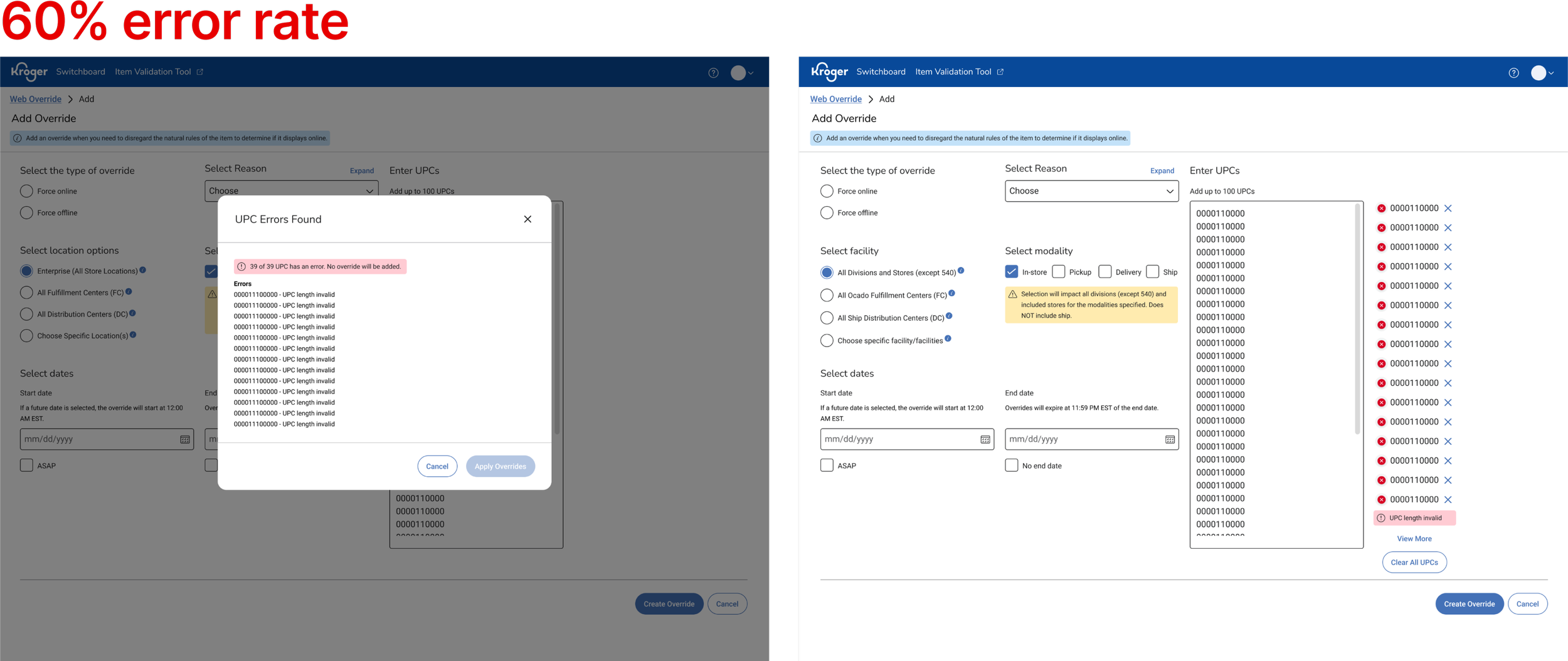
Item Management Submission
Key Activities
Moderated interviews, wire framing, prototyping, UI Design, usability testing, product release
Problem
Kroger’s Switchboard Add Overrides Page had a high error rate leading to poor usability and inefficiency for users. Additionally, the UI does not adhere to Kroger Design System (KDS) Standards, creating inconsistencies and reducing design cohesion across tools.
Outcome
Redesign Switchboard’s Add Override Page to improve usability and reduce error rate.
Role
Sole Design Lead
Team
1 PM, 1TPM, 1 Scrum Master, 2 QA, and 7 Software Engineers
Timeline
One quarter (6 two week sprints)
The redesign of Switchboard’s Add Overrides page was met with an incredible reaction from our users when demo’ed at a user panel session before its release.
OUTCOME
The new design led to significant improvements in usability and efficiency as measured by:
23% decrease in time taken to create overrides
80% decreased in error rates
Updated Add Overrides Page
Error Handling in Updated Add Overrides Page
Confirmation Modal
View Errors Modal
BACKGROUND
What is Switchboard?
Switchboard is a tool used by Kroger’s digital merchandisers to manage the e-commerce sellable status of an unplanned item (ie, think emergency situations where there is a recall and the product needs to be removed from the website).
The add override page is a form submitted to add or remove an item from Kroger’s online presence.
RESEARCH & DISCOVERY
Based off Google Analytics data, we found that the Add Overrides Page had a 42% success rate. I lead a discovery to understand why it was so low.
Moderated User Interviews
I scheduled moderated sessions with 5 digital merchants.
In these sessions, I observed how they currently use and navigate through the add overrides page.
I also aimed to identify pain points and gaps in their current experience.
Research showed that our users displayed inefficient behavior when navigating the page and that invalid UPCs were the main cause of error for the overrides page.
Confusing user behavior due to form layout:
Our users go through two different flows, for the first two columns they fill out the fields in an F pattern and then go back to the top right to complete the third column.
Invalid UPCs are the main reason for errors when creating overrides:
From our interviews, we learned that a majority of the error rates were due to merchandisers inputting invalid UPCs. The UPCs would not be verified until after the override is submitted. This process would add additions steps into fixing the errors and resubmitting the override.
IDEATION & CONCEPT DEVELOPMENT
I created user flows to document current and future state.
I mapped out the current steps that Digital Merchandisers take to Create a Web Override and discovered that the errors add considerable delays. And then created an updated user flow, focusing on using on-page validation to reduce the number of steps caused by errors.
Low fidelity wireframes were drafted, prioritizing a user-friendly layout and on-page validation to reduce redundancies and save time.
Added on-page validation that:
Sorts errors to the top of the field box.
Labels specific UPCs with issues.
Merchandisers can now fix errors directly on the page, removing the need to copy/paste into Excel.
On-page validation to reduce errors
Grouped related fields together.
Labeled each group clearly.
Sequenced fields in a logical, user-familiar order.
Labeled and ordered form fields for better organization
Simplified layout to guide user flow
Adopted a single-column layout for a more direct path.
Placed fields side-by-side only when directly related.
Stacked checkboxes to reinforce a vertical journey.
PROTOTYPING & TESTING
Feedback session with product team and users helped to identify areas for change and iteration.
After having conversations with the product team, we aligned on the wireframes and pages to be used for design feedback with our users. I scheduled feedback sessions with 4 different users.
My goal for the sessions were
Get initial reactions and feedback on the new layout
Validate the order and sequence of fields.
Updated input field order based off priority
Before: UPC was at the bottom because it was the last step in their current behavior.
After: I moved UPC to the top/front after getting feedback that the UPCs are the most important part of the field and is what all the fields are about.
Error handling to include correct and incorrect inputs
Before: Previous modal only showed list of errors.
After: I updated the design to display both Valid and Invalid UPCs after users shared that it would be valuable for them to have a list of both and not just the errors.
FINAL DESIGNS
On the left, the original design presented challenges such as unclear layout and inefficient error handling.
On the right, the final design reflects the result of user feedback, iterative improvements, user friendly form layout, and improving the error handling experience.
The designs below show the changes from the original interface to the newly enhanced Add Overrides experience.
Previous add overrides page
Previous error handing on Web Overrides Page
Previous confirmation modal
Redesigned add overrides page.
Updated confirmation modal sorts and lists both valid and invalid UPCs.
Updated error handing that incorporates on page validations and a view all modal.
The positive impact on user efficiency was immediate! After one month of release we recorded:
Time to create override reduced by 23%, saving approximately 87 Digital Merchandisers 2 hours per week
80% decrease in UPC errors when submitting Add Overrides
Enhanced add overrides page was used to create ~1,100 new overrides


